Photo by d'n'c
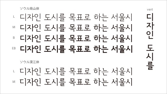
In September 2008, Seoul metropolitan city developed and unveiled the original typefaces named "Seoul Nan-San-che" and "Seoul Han-Kang-che". Recently there is a growing tendency toward building up the brand of the city all over the world. In 2007, Seould was selected as world design capital of 2010 by International Centre for Settlement of Investment Dispute (ICSID). There started the projects around designing the nature of Seoul city, the original typeface was made in such context.
Seoul Nan-San-che is a gothic typeface and Seoul Han-Kang-che is a Ming-cho typeface. Nan-San-che family consists of 4 weights: L, M, B, EB, and
vertical typograhical feature is included. Han-Kang-che family consists of 2 weights: L, M. These 7 typefaces are differ from other normal gothic and ming-cho typeface in detail and development process. They are made with the characteristic of the history and culture of Seoul. They have a motif of a traditional house "Han-ok" and a curve of roof tile in the detail.
In the development process the questionnair was performed to adopt the opinion of the citizen, and there was over a hundred thousands of opinion at both online and offline.
Seoul typeface was made with the participation of citizens, however, they are not so popular in Seoul city with population of 10 million. They are going to be used all the way in the documens of the city, sign system, uniforms of public institutions, taxi. They would be popular gradually in long-term use, and would be recognized the nature of Seoul in them.
Seoul typefaces can be downloaded by the web site of the Seoul city and the use of persons and companies are permitted. Seoul city and Microsoft Korea is in cooperation, so the typefaces are also downloadable from the web site of Microsoft.


